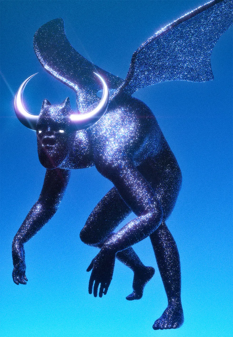
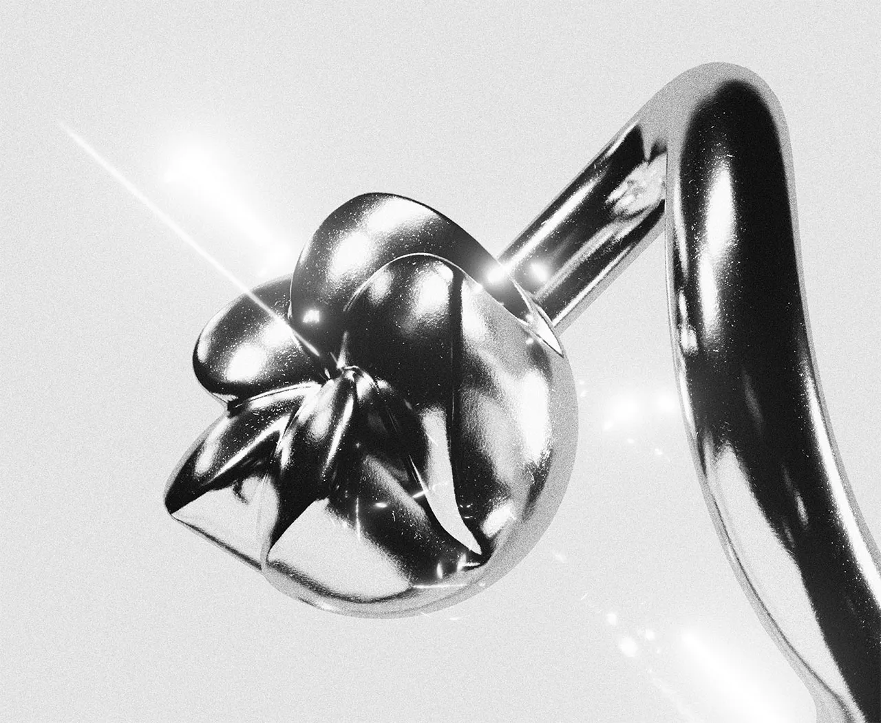
Never Never
3D product imagery for the Never Never gin range, made with the agency Sick Dog Wolf Man. We teamed up with the agency again to take Never Never’s refreshed branding and open it up into a world of its own, one that feels rich and dreamlike.
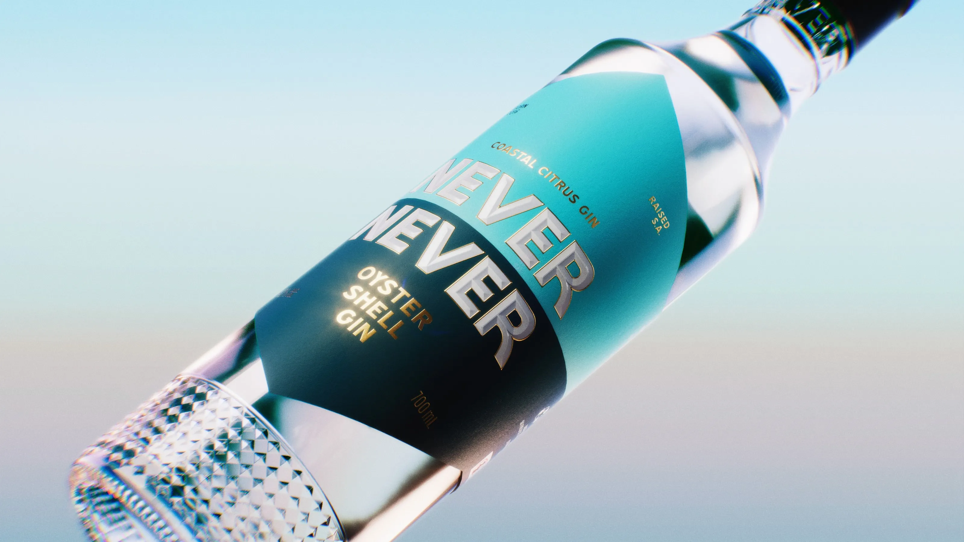
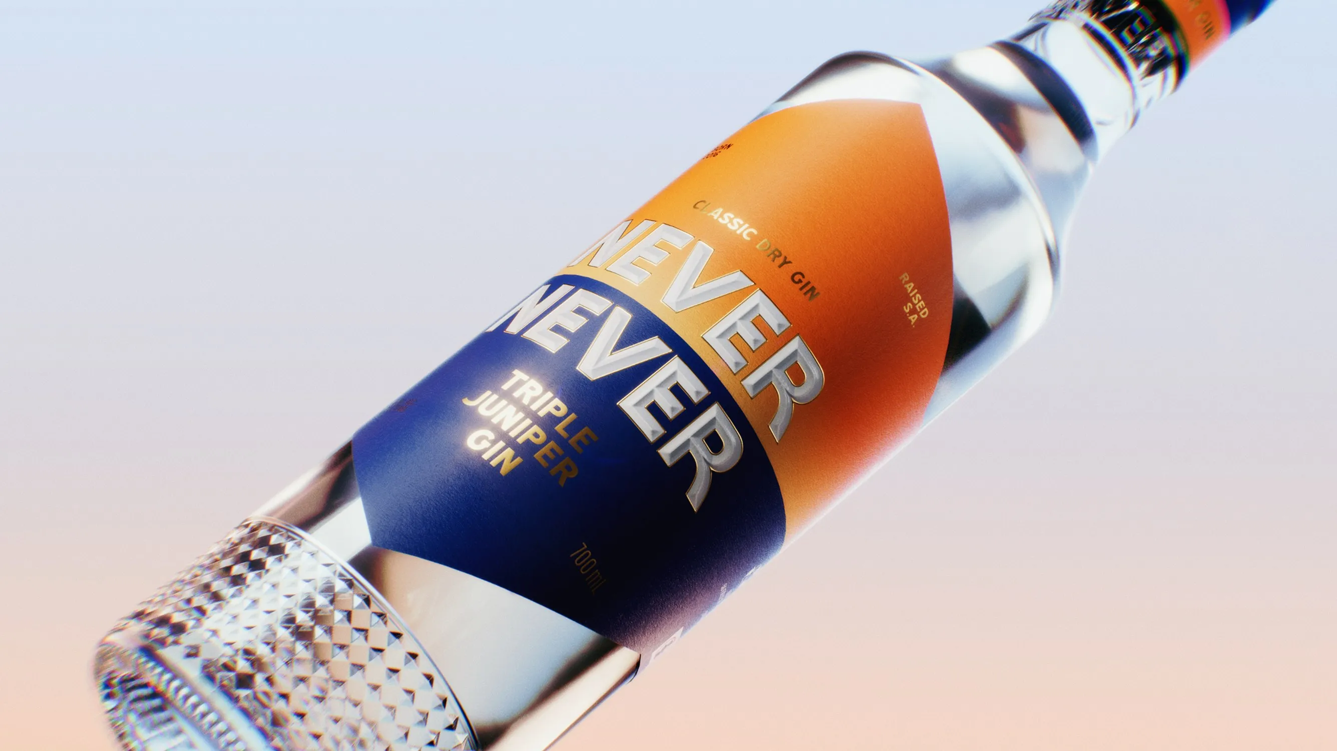
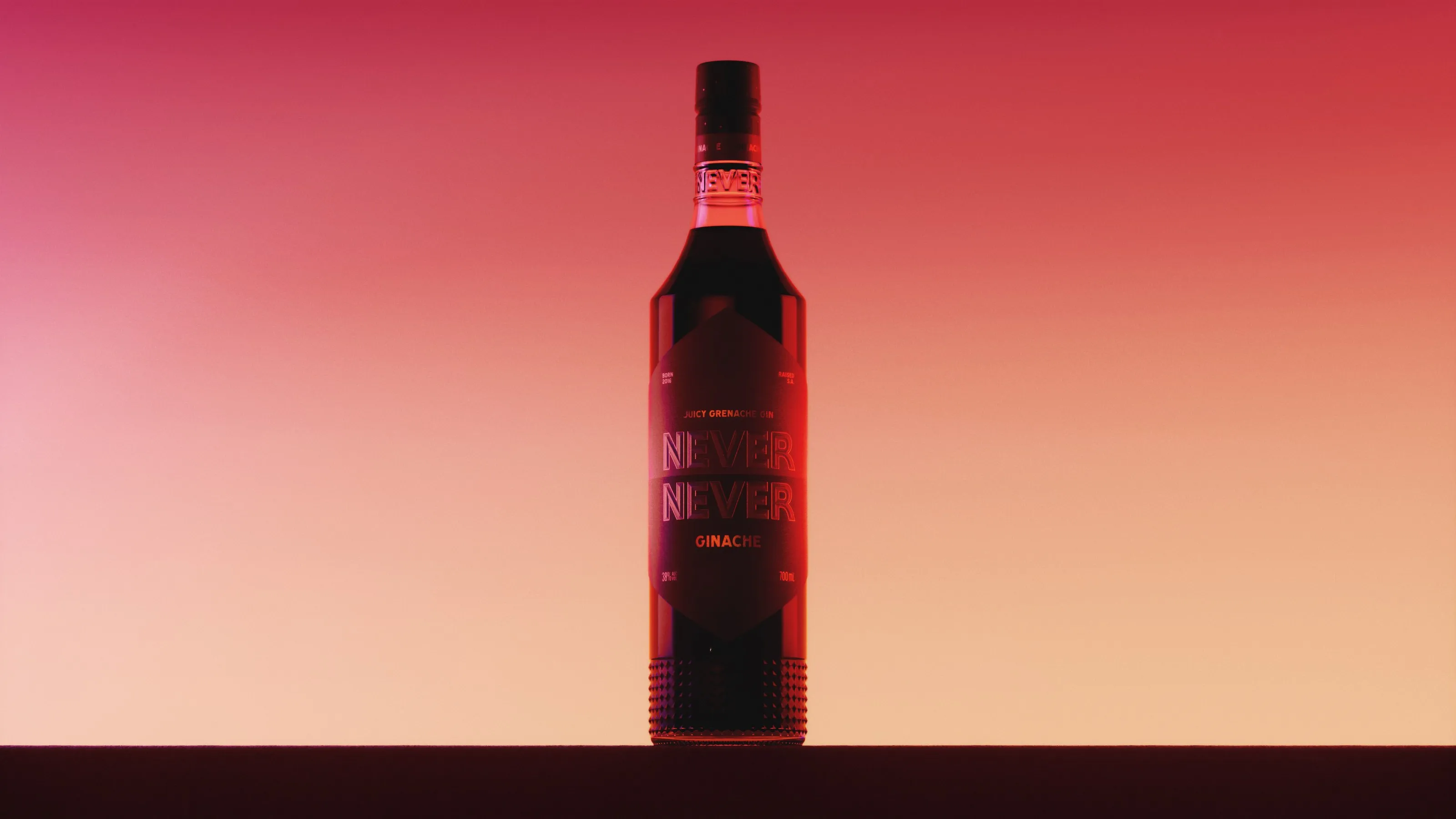
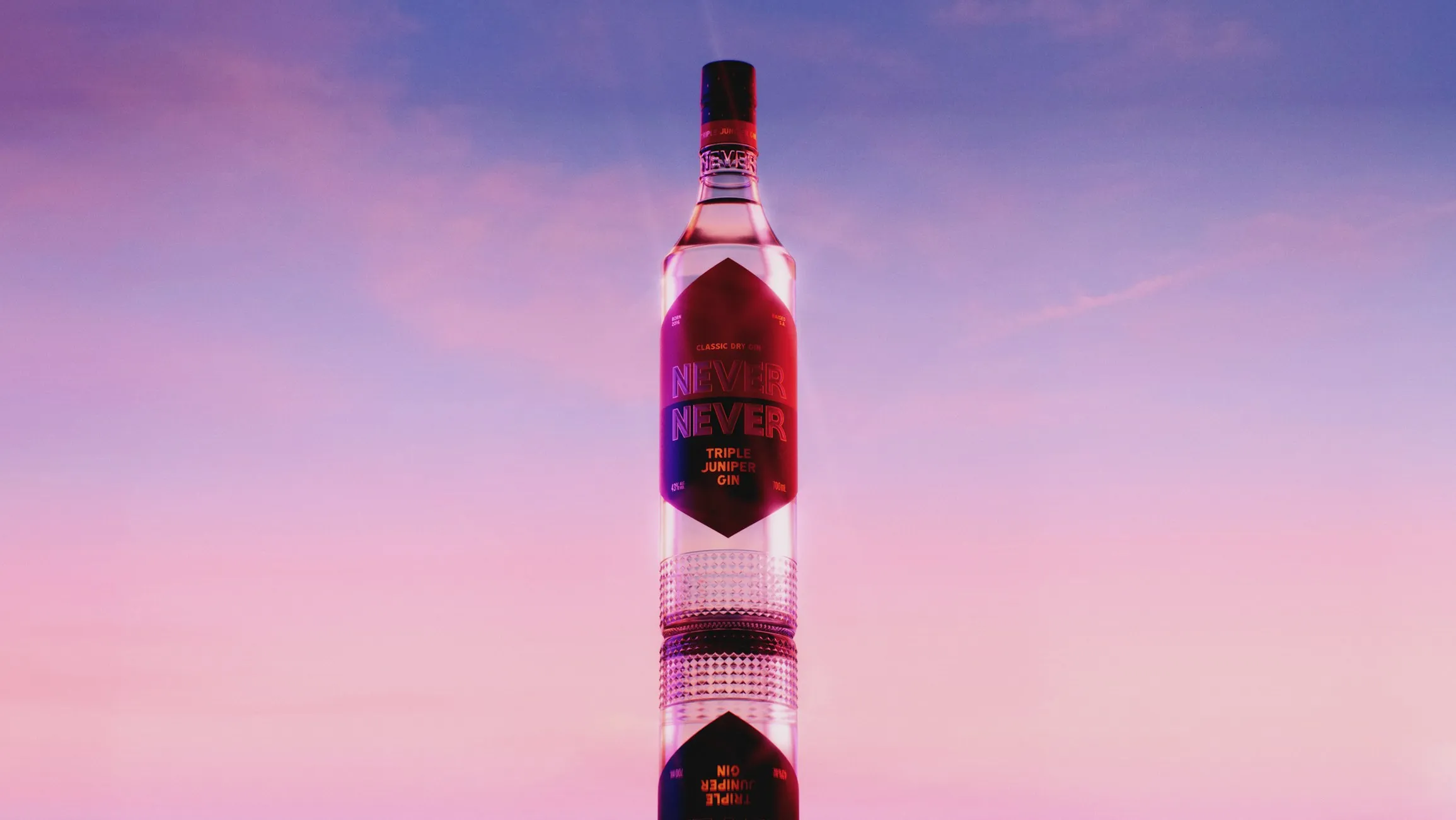
That world is drawn from the colour palettes of Australian horizons: sunrises, sunsets and the shifting light in between. Every frame was built around light and reflection, with careful material development for the glass, the bottle’s bevels and the gin itself.
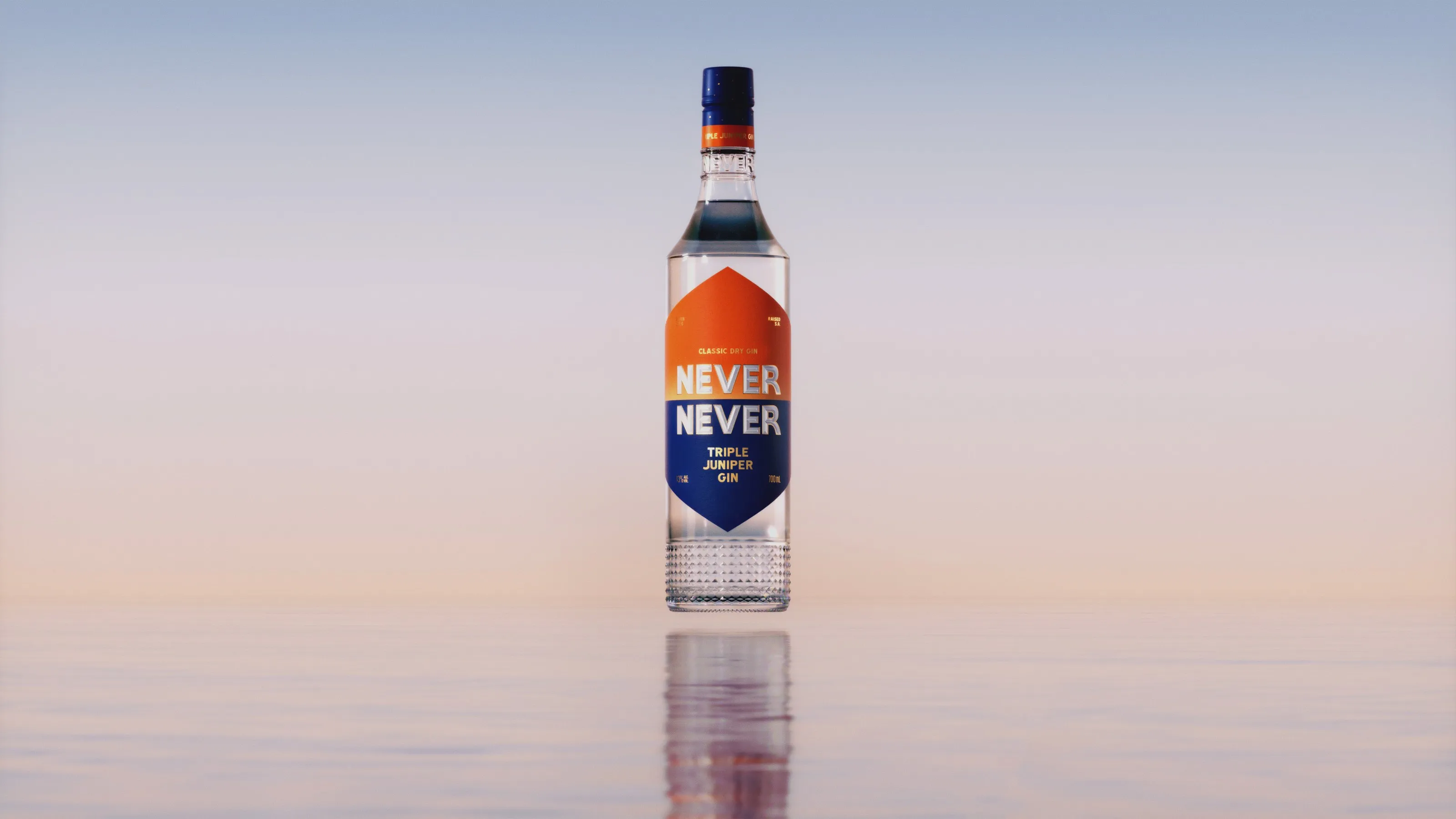
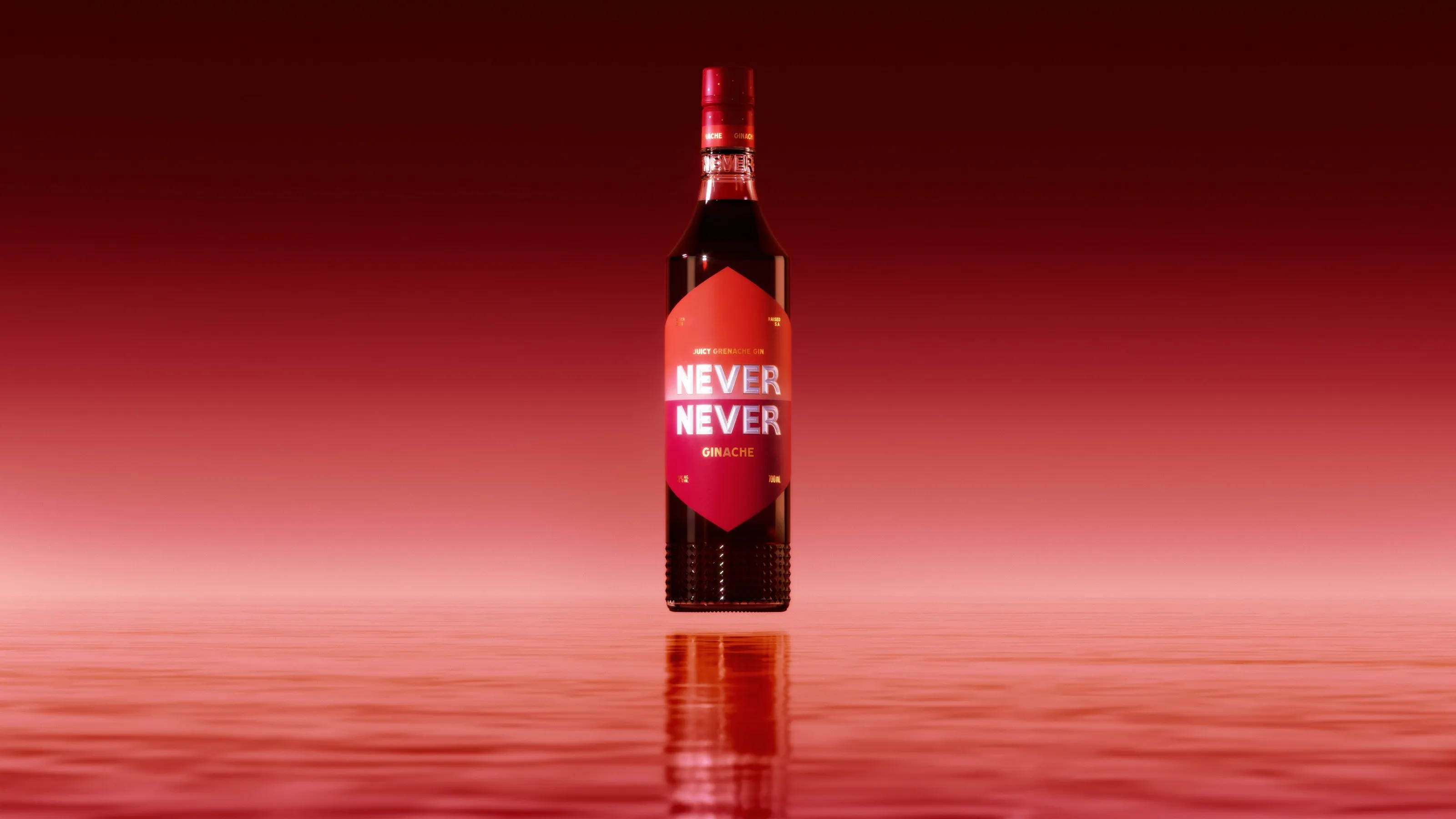
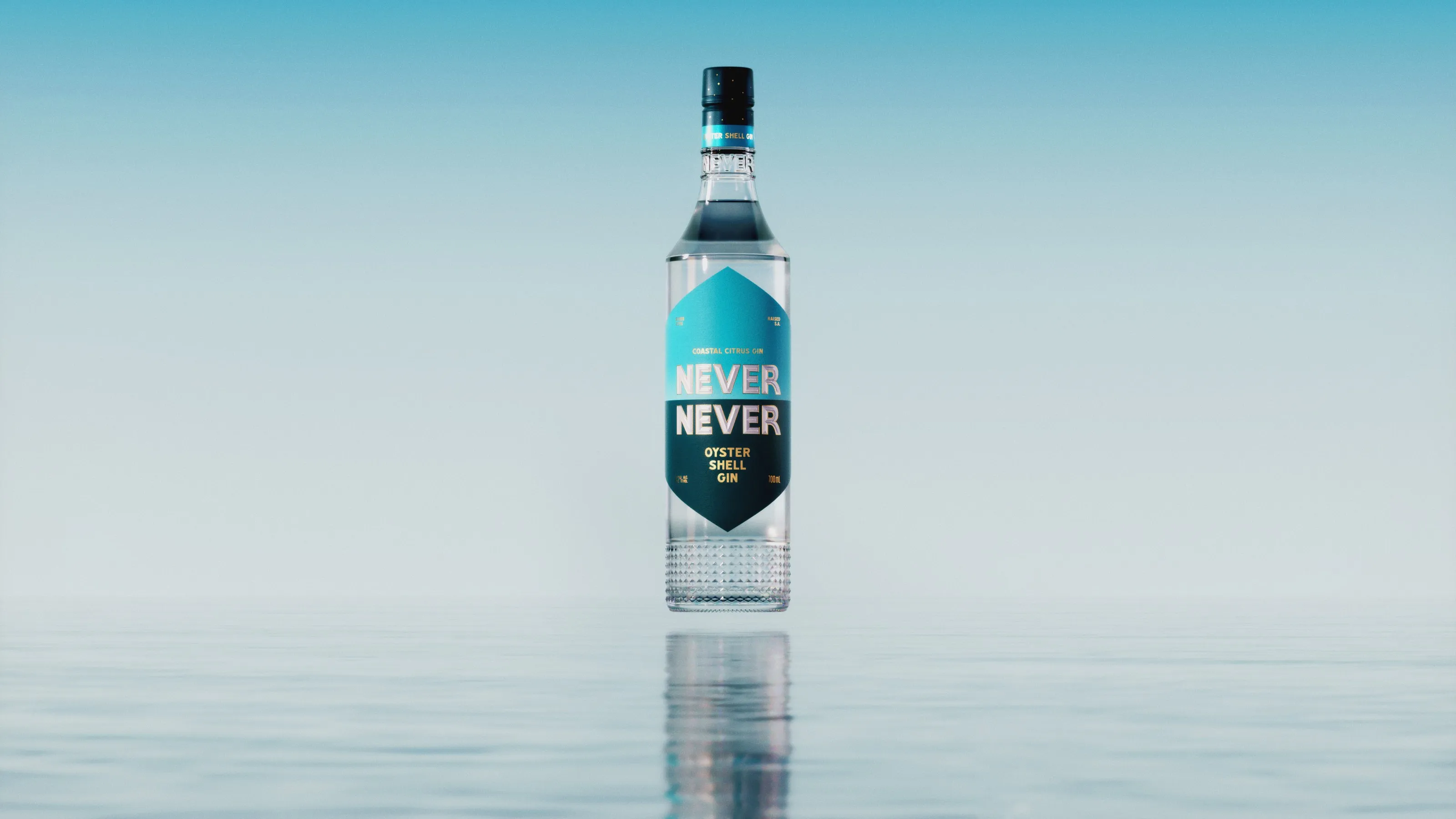
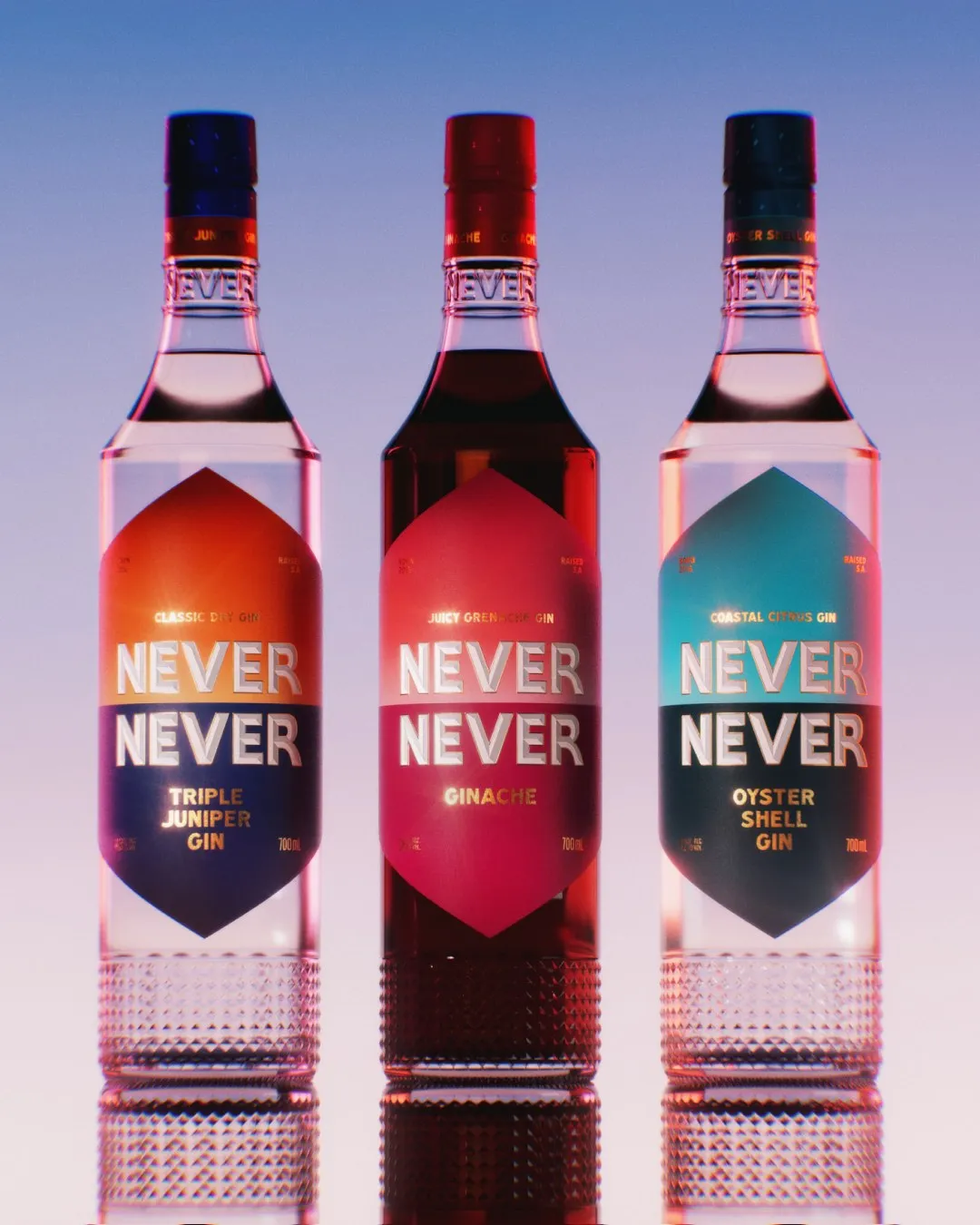
At its heart, the project is about the relationship between light and reflection. Material development was key: the clarity of the glass, the way light breaks across the bevelled base, and the colour and depth of the gin itself.
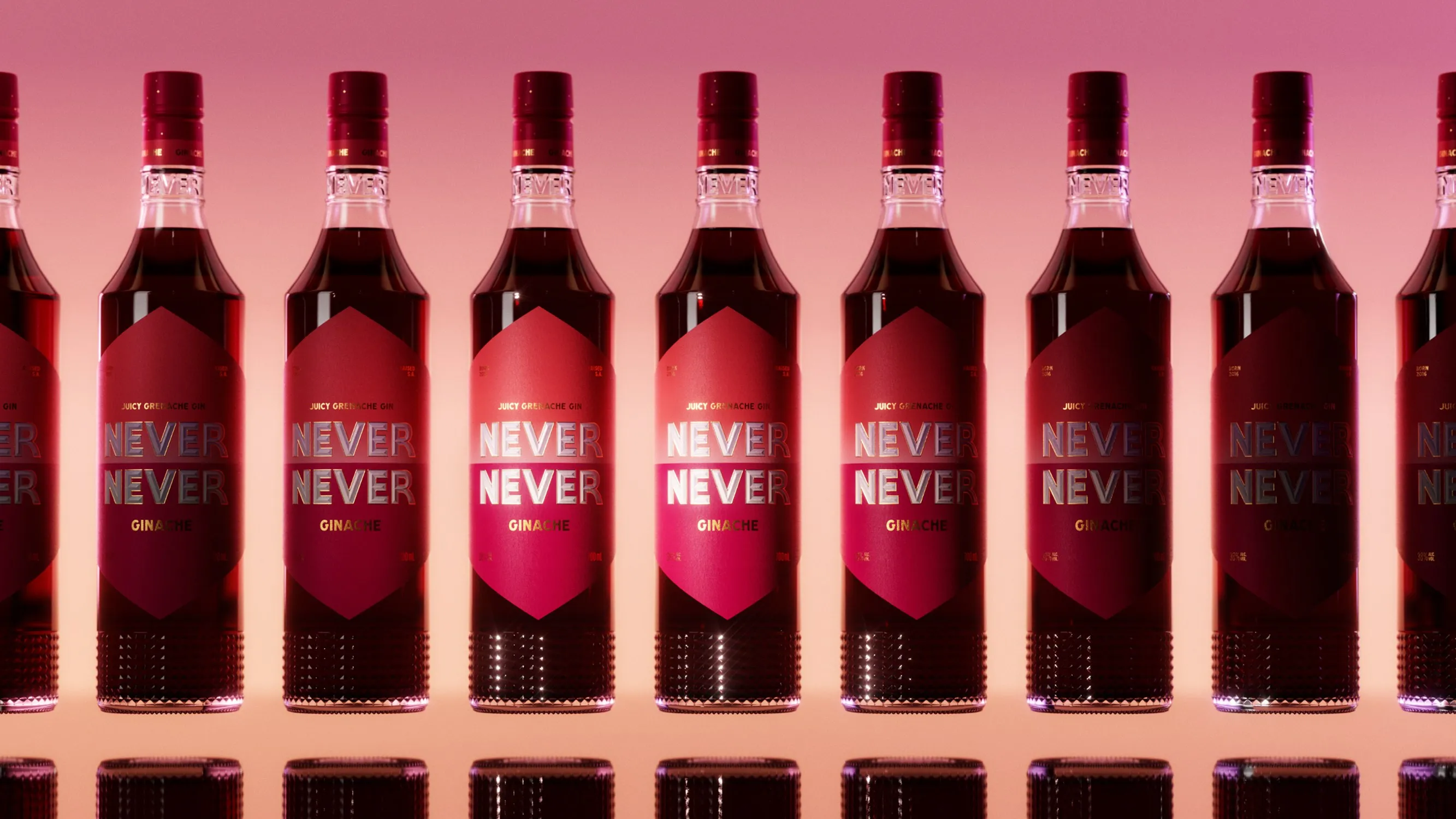
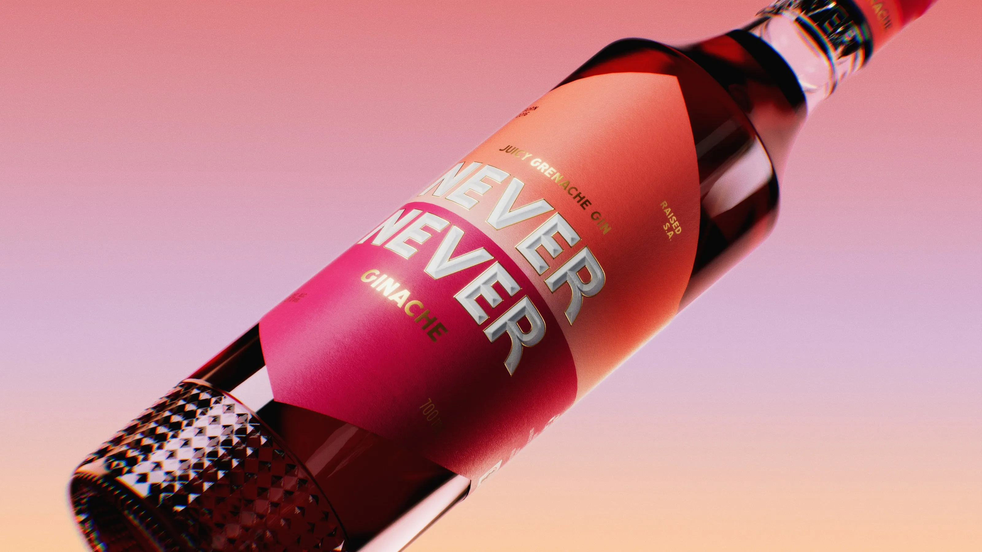
Each gin in the range sits on its own horizon. Triple Juniper takes the soft light of sunrise, Ginache a deep red sunset and Oyster Shell the cool blue of a coastal morning.
That transitional light, the moment between day and night, speaks to the divide in the new label design, where two colours meet across the bottle.